Expositions / Edition
……………………………………….
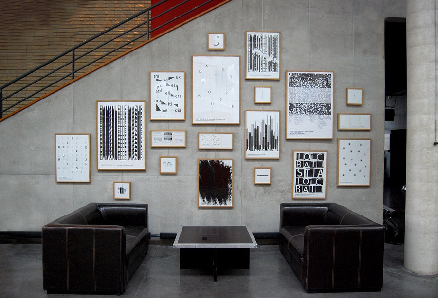
Graphic design that sounds - 29 janv > 24 avril 2010 – La Nef – Angoulême
Biennales / international graphic design events
• Hong Kong International Poster Triennial 2014 – décembre 2014 – mars 2015 – Hong Kong, Chine
• Golden Bee 10 Moscow Global Biennale of Graphic Design - 9/14 octobre 2012 – Moscou, Russie
• 23 International Poster Biennale – Warsaw 2012 – septembre – Warszawa, Pologne
• 13th International Biennial of Theatre Posters – Rzeszow 2011, Pologne
• Hong Kong International Poster Triennial 2010 – décembre 2010 – mai 2011 – Hong Kong
• Golden Bee 9 Moscow International Biennale of Graphic Design – sept. 2010 – Moscou, Russie
• International Biennial of Graphic Design Brno 2010 – juin – octobre 2010 (République Tchèque)
• Vibre Poster Festival – février 2010 – Tehran, Iran
• The 10th Tehran International Poster Biennial – 2009 – Tehran, Iran
• 3. International Biennial Of Poster Bolivia Bicebe – 18.21 novembre 2009 – Bolivie
• 9th International Poster Triennial In Toyama (Museum Of Modern Art) – juil. sept. 2009 – Toyama, Japon
• 17th Lathi Poster Biennal (Lahti Art Museum) – juin.sept. 2009 – Finlande
• 7th International Triennial «the 4th Block» – avril 2009 – Kharkov, Ukraine
• Igdb 5 (Ningbo Museum Of Art) – déc. 2008 – Chine
• Golden Bee 8 Moscow International Biennale of Graphic Design – sept. 2008 – Moscou, Russie
• 7e Computer Art Biennale - déc. 2006 – Rzeszow, Pologne
• 6e Computer Art Biennale - déc. 2004 – Rzeszow, Pologne
Expositions personnelles / personal exhibitions
• Graphic design that sounds – 29 janv > 24 avril 2010 – La Nef – Angoulême
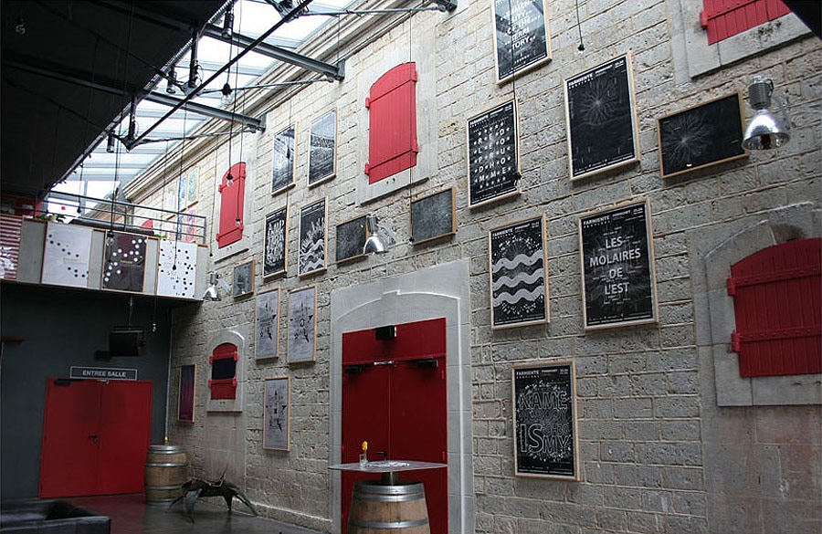
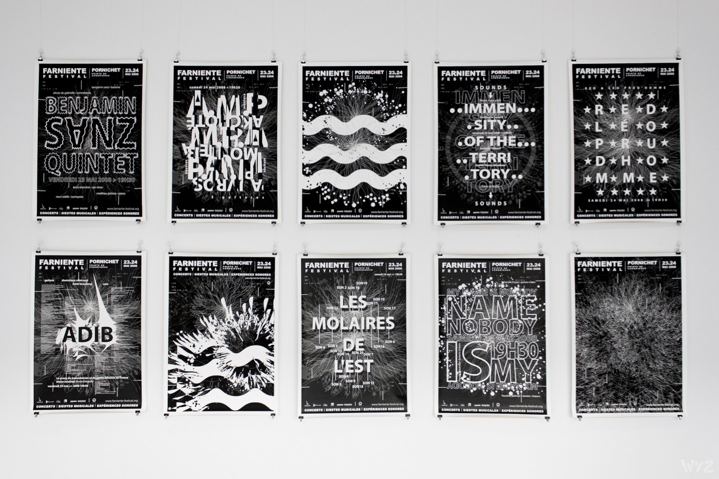
• Farniente Festival – avril 2008 – Pornichet
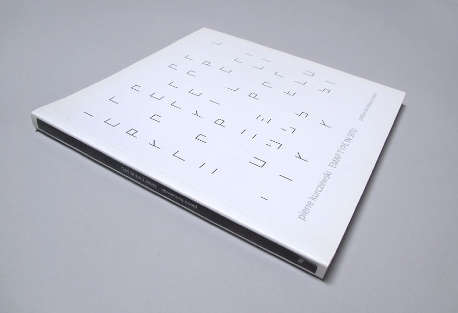
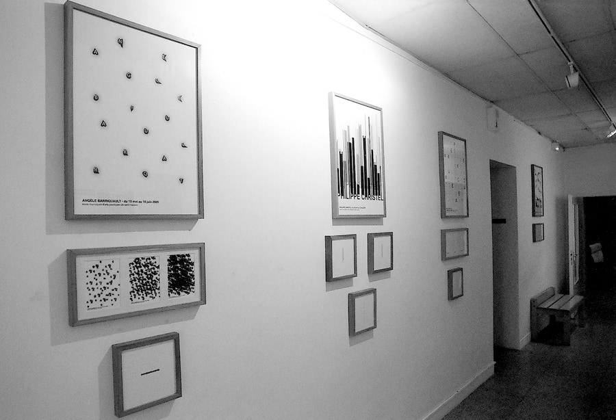
• Emap type in situ – 3>19 mars 2005 – Emap – Saint-Nazaire
Expositions collectives /collective exhibitions
• Grafism’ 2012 – L’affiche, la rue - 2 mars > 7 avril 2012 – Nantes
• Graphisme Dans La Rue – juin 2008 – Fontenay-sous-bois
• Journées De La Paix – sept. 2006 – Vitry-sur-seine
Collections Musées / Muséum collection
• The National Museum in Poznan – Poster and Design Gallery – 2018
Edition personnel
• Emap type in situ – pierre kurczewski – 2005
- - - - - - - - - - - - - - - - - - - - - - - - - - - - - - - - - - - - - - - - - - - - - - - - - - - - - - - - - - - - - - - - - - - - - - - - - - - - - - - - - - - - -
emap type in situ – préface de niklaus troxler, 2005 - (LIVRE)
Que devient une affiche quand elle prend la liberté de flirter, voire de dépasser les frontières des contraintes, jusqu’à parfois l’effacement des éléments incontournables d’informations ? Nous amène-t-elle loin, ailleurs, ou insiste-t-elle, au contraire, encore plus dans ce pourquoi elle a été au départ initiée ?
What becomes of a poster when it happens to flirt or overcome the limits of constraints to the point where it doesn’t show any of the inevitable elements of information ? Does it take us afar, elsewhere or does it – on the contrary – insist even more on that which it was initiated for ?
Typography that sounds !
Quand je regarde le travail typographique de Pierre Kurczewski je peux entendre des rythmes et des mélodies : sa typographie est une musique.
J’ai moi-même toujours été imprégné de musique. Tout ce qui me fascine dans la musique je peux le retrouver dans le design : la couleur du son, le contraste, le rythme, la mélodie, le souffle, la structure, l’interaction, le tempo… Et il me semble que c’est ce que l’on ressent dans le travail de Pierre.
Ce qui le fascine c’est la progression : son graphisme commence par de simples notes, de simples mélodies et progresse vers des structures musicales beaucoup plus dures et plus compactes.
Même quand son espace de travail est rempli, il y a encore des sons et des mélodies.
Son travail vient du silence pour aller vers le bruit, de structures simples vers de plus complexes.
Il me fait parfois penser aux touches noires et blanches d’un piano, à un saxophone scintillant avec ses clefs ouvertes.
Mais là où son travail prend toute son ampleur c’est quand il ne s’appuie sur rien d’autres que le caractère, juste les lettres et peut être l’espace qui se trouve entre elles… ou qui les recouvre en partie.
Niklaus Troxler, suisse, février 2005.
When I look to the typographical works of Pierre Kurczewski I can hear melodies and rhythms : Typography that sounds !
Me myself was always impressed by music. Everything what is fascinating me in music, I can transfer into design : colour sound, contrast, rhythm, melody, breath, structure, interaction, tempo… And it seems to me, so does it in Pierre’s work.
He is fascinated in progressions : his design starts with single notes, with a simple melody. He progresses into heavy musical structures and clusters. Even when he fills up the format, there is still enough sound and melody.
His work goes from silence to noise, from simplicity to complex structure.
The typographic designs remind me in the black and white pattern of the keys of a piano, a glittering saxophone with its branched out keys.
His work is strongest when it doesn’t need more than type, just the letters and maybe the space between… or overlapped.
Niklaus Troxler, Switzerland, februry 2005.
- - - - - - - - - - - - - - - - - - - - - - - - - - - - - - - - - - - - - - - - - - - - - - - - - - - - - - - - - - - - - - - - - - - - - - - - - - - - - - - - - - - - -
emap type in situ – mars 2005 - Saint-Nazaire (EXPOSITION)


- - - - - - - - - - - - - - - - - - - - - - - - - - - - - - - - - - - - - - - - - - - - - - - - - - - - - - - - - - - - - - - - - - - - - - - - - - - - - - - - - - - - -
Graphic design that sounds - 29 janv > 24 avril 2010 – La Nef – Angoulême
exposition angoulême « graphic design that sounds » – 2010
- - - - - - - - - - - - - - - - - - - - - - - - - - - - - - - - - - - - - - - - - - - - - - - - - - - - - - - - - - - - - - - - - - - - - - - - - - - - - - - - - - - - -
l’affiche la rue - 2012 – La Nef – Nantes
-